

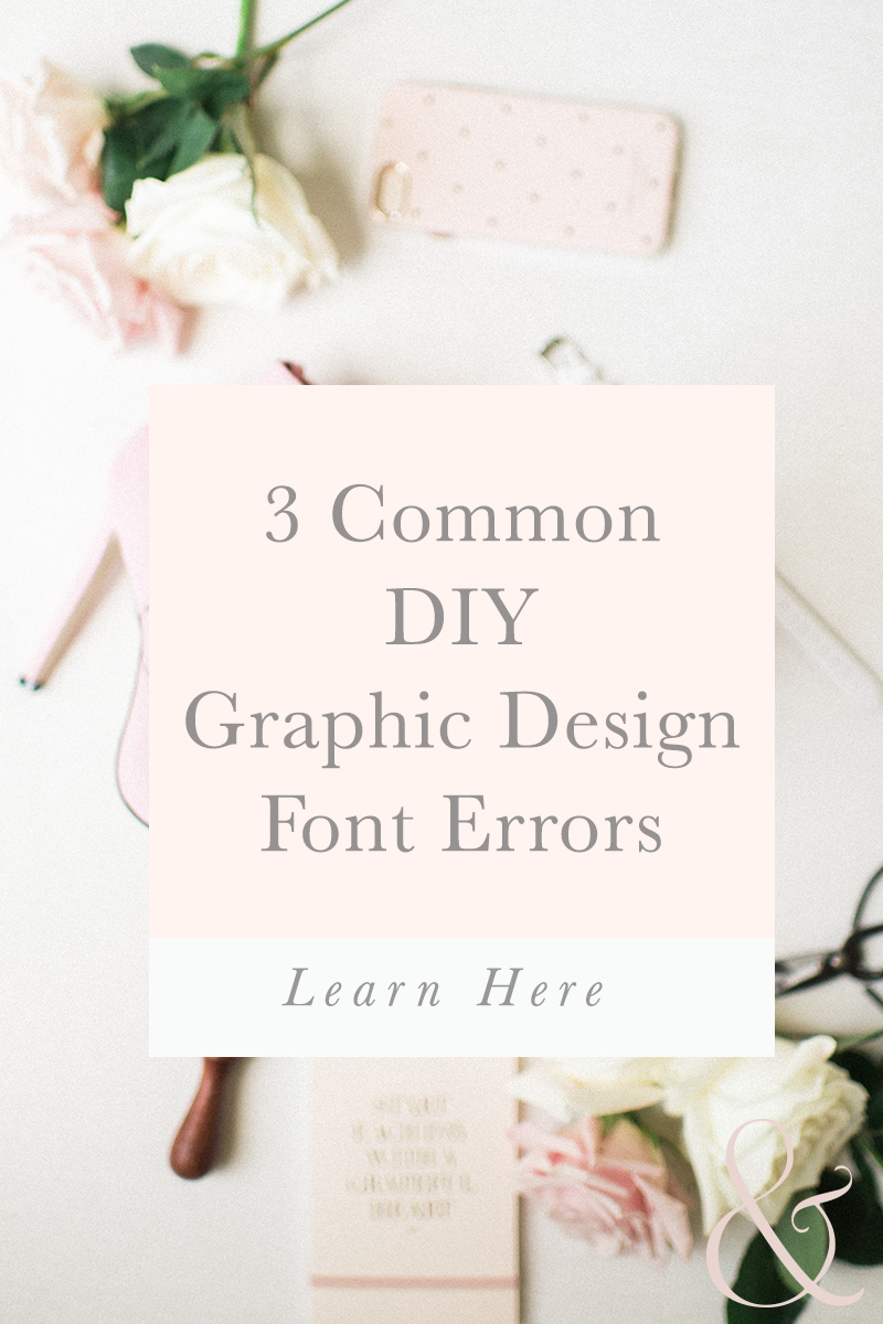
Branding your small business is no easy task. If you go the DIY route you’ll want to have some guidelines when creating your visuals. A big part of your visual brand is fonts. Fonts have the ability to make viewers feel a certain way and communicate a message about you and your business. You need to make sure you are using fonts for good not bad. Here are three common DIY graphic design font errors:
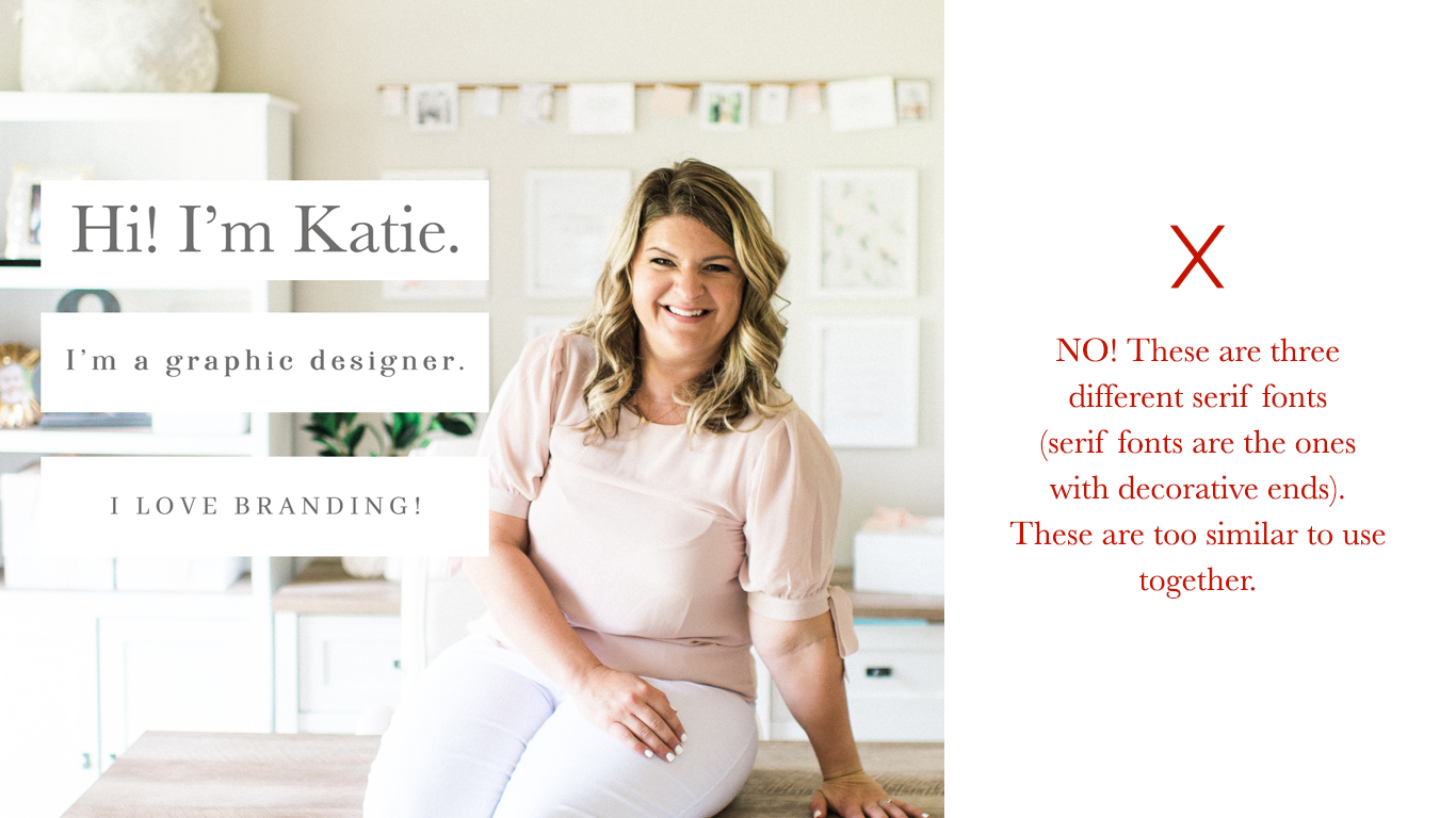
- Using too many similar fonts – I always shake my head when I see multiple fonts that look the same whether it’s two similar serif or non serif fonts. You need to minimize the fonts you use. As a rule of thumb you should be using no more than three fonts on any given medium (i.e. an instagram post graphic, a page on your website). Using more than three fonts can make the graphic feel cluttered and look amateur. You can style three fonts in many ways which is a trick around the three font rule. So for example…

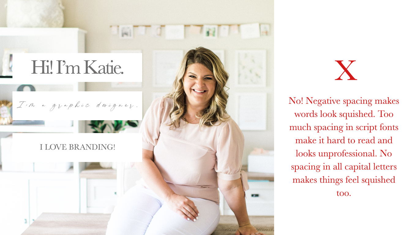
- Too much or too little spacing – Kerning (or space between letters) is a GREAT way to creatively use fonts and it can serve a great purpose in helping the viewer to have a good reading experience. However, if you have too much spacing or too little it looks tacky. As a rule of thumb never do big spacing in script fonts, never do negative spacing unless you have a reason to do so, and always put some spacing in between all capital letter words. For example:

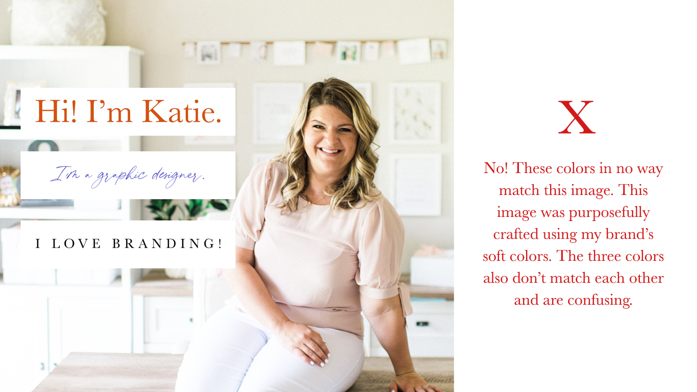
- Using too many colors! This is a HUGE pet peeve of mine. In general I always recommend using ONE color for fonts in any given graphic. An exception would be if you are trying to highlight a specific time/day for an event or if you have an accent font on your website. Even with the event exception, however, you can opt to make a font bolder and bigger instead of changing the color. Too many colors makes it hard on a viewer’s eyes. They aren’t sure where to read. Also, don’t use BRIGHT colors. Use muted tones that are easier on the eyes. Lastly, pay attention to the color in your images in graphics. Let that dictate your font color. That being said…your imagery should be using colors in your brand to match the overall aesthetic and therefore you should be using your brand’s colors. Having a color palette for your brand is KEY! Use the same hex codes whenever you make graphics. For example…

If you are tired of a DIY brand I’d love to help you! Find out more here!


Leave a Comment