As a graphic designer I design websites all the time. I always design the home page first and get approval for that before moving on to anything else. The home page is key. It is where a user will make their first impression and decide right away if they want to move on or look around more. These three tips are good for reference when designing your home page:
1) KEEP IT SIMPLE – A cluttered menu bar with more than 6 links can be distracting and people don’t know where to click. Less options is a good thing. Dropdowns are okay, but sometimes people have up to 10 main menu buttons and it just looks overwhelming. On that note keep the design simple. It doesn’t mean you have to have a design just like everything else and be boring. What I mean is don’t have so much information that it overwhelms people. Users don’t like to have too many information thrown at them. When you have too many images/boxes/text you tend to lose the focal point of your site and the user doesn’t know where to have their attention drawn to.
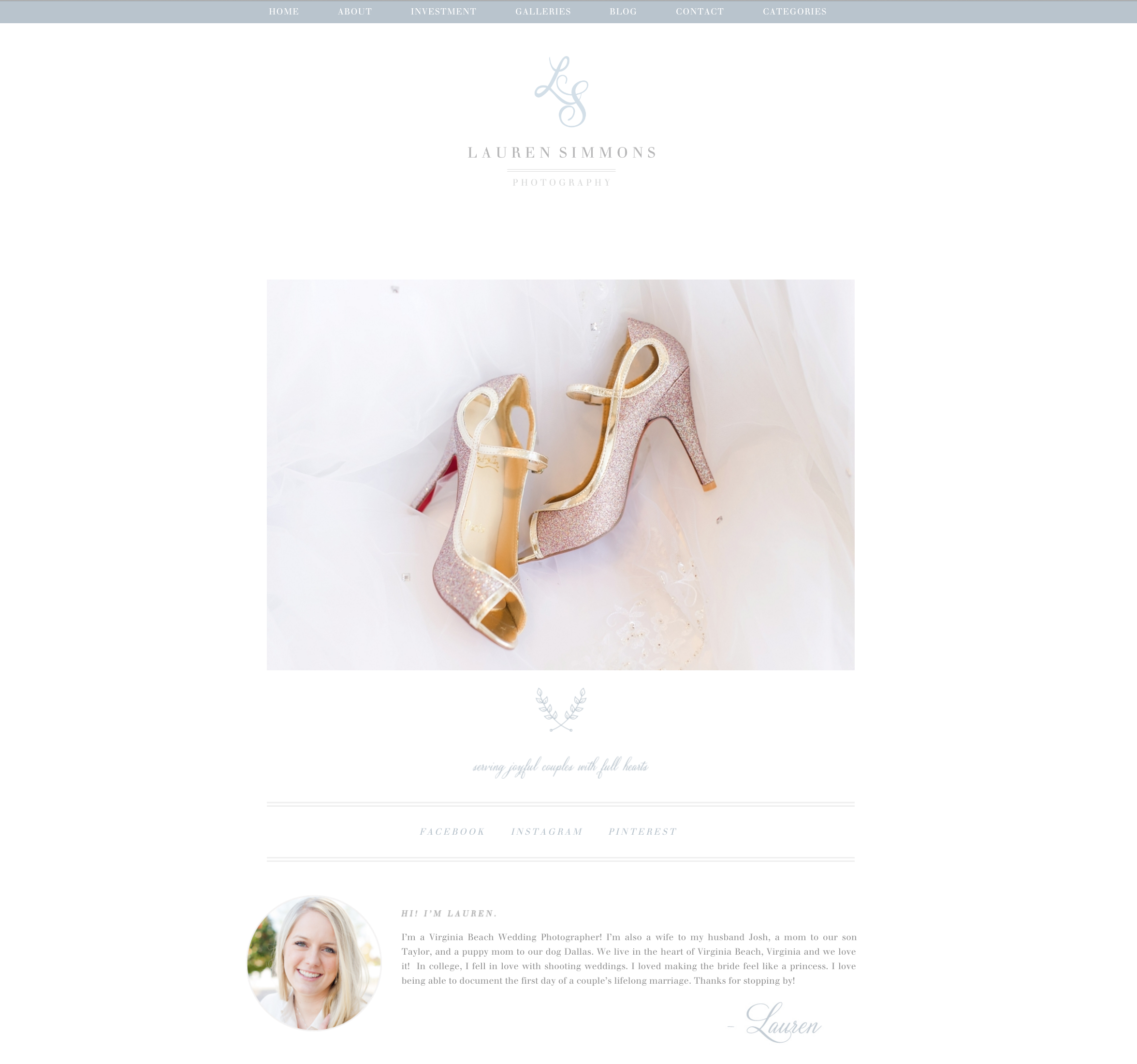
www.lauren-simmons.com
2) PROFESSIONAL IMAGES – Use professional images! Whether you are a photographer or selling goods you need to have pretty images. Ugly images are a major turn off and scream AMATEUR.
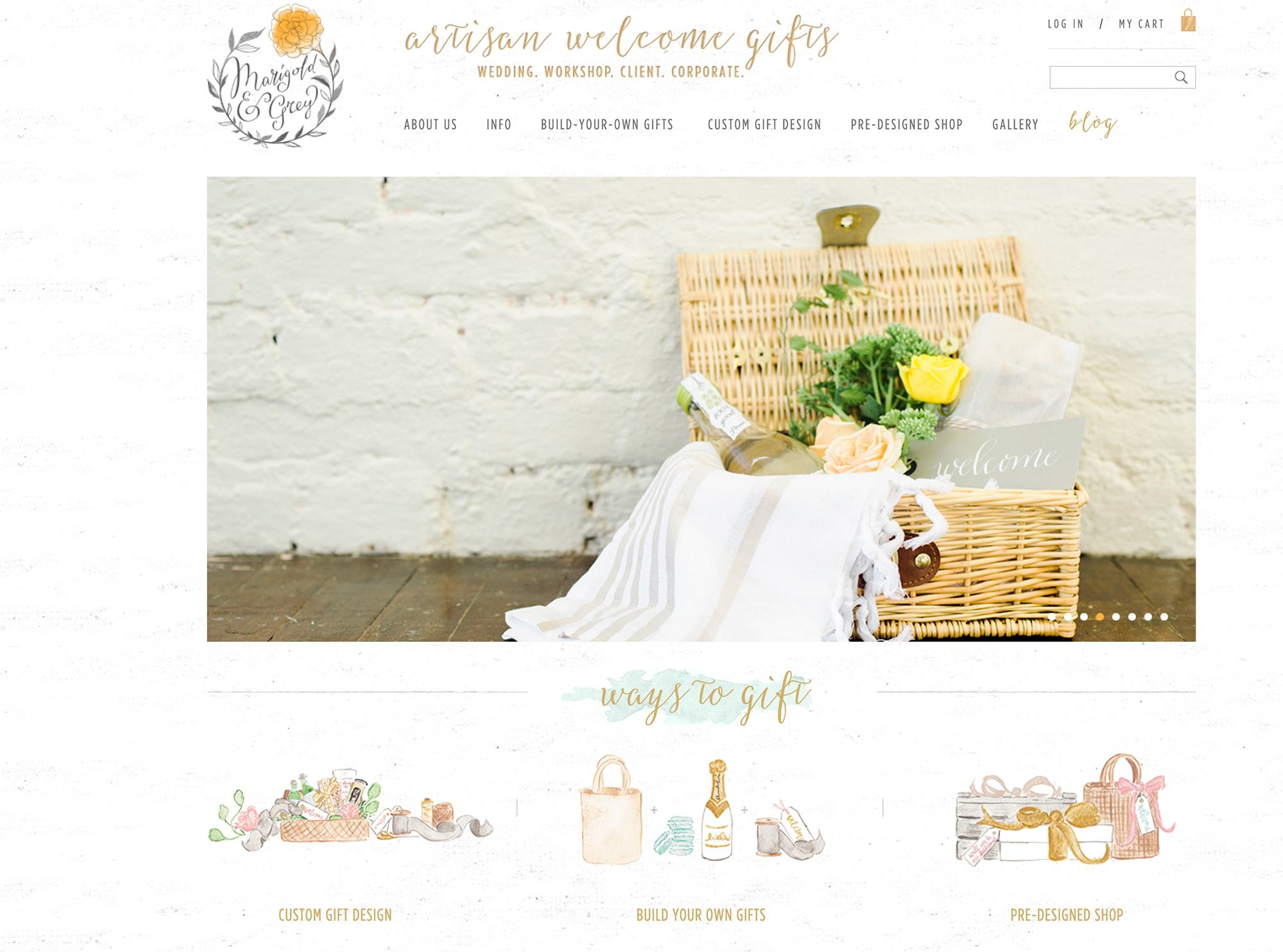
(I did not do this site but Marigold & Grey does an awesome job at having professional images! www.marigoldgrey.com)
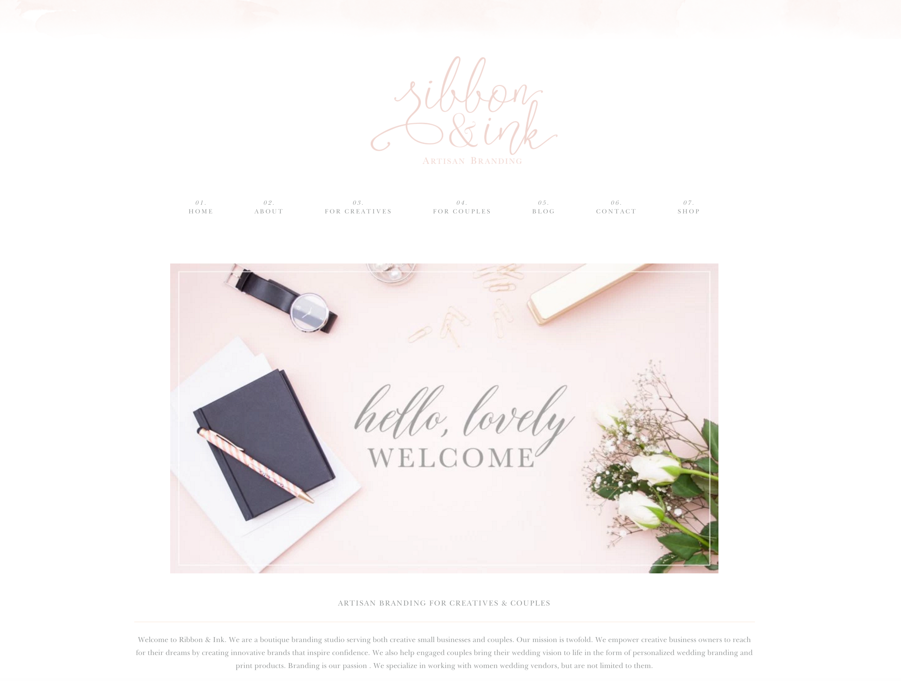
3) SAY WHAT YOU DO – Let users know immeadiately upon viewing your site what it is you do. For some people like photographers who have the word “photography” in their logo it might be obvious, but even they need to let people know what type of photography they do. My business name Ribbon & Ink doesn’t say what I do at all and that’s why I keep my tagline “artisan branding” in my logo to at least let people know that little bit. I then have a small descriptive paragraph on my home page that cuts to the chase and let’s people know exactly what I do. If someone comes to your site and is questioning what you do they’ll leave. You want to make it very obvious and keep people who are looking for what you do engaged.
Leave a Comment