I’m having a blast with my current full branding wedding planner client, TreBella Events. Shawn is an amazingly talented Washington D.C. and Annapolis based wedding planner and floral designer who came to me with a serious need of a rebrand as she hadn’t touched her brand in nearly a decade! Her brand is a bit different from my usual light and airy brands using black, silver, and purple. It’s bold and glam for sure and I love it!
With every one of my full branding wedding vendor clients I have a brand coaching session to determine their ideal client, niche, discuss pricing, and so much more. I have a business background and I use those skills to really get behind the scenes of a brand. You need to know who you are trying to sell to in order to make a visual brand and not just make something you think is pretty.
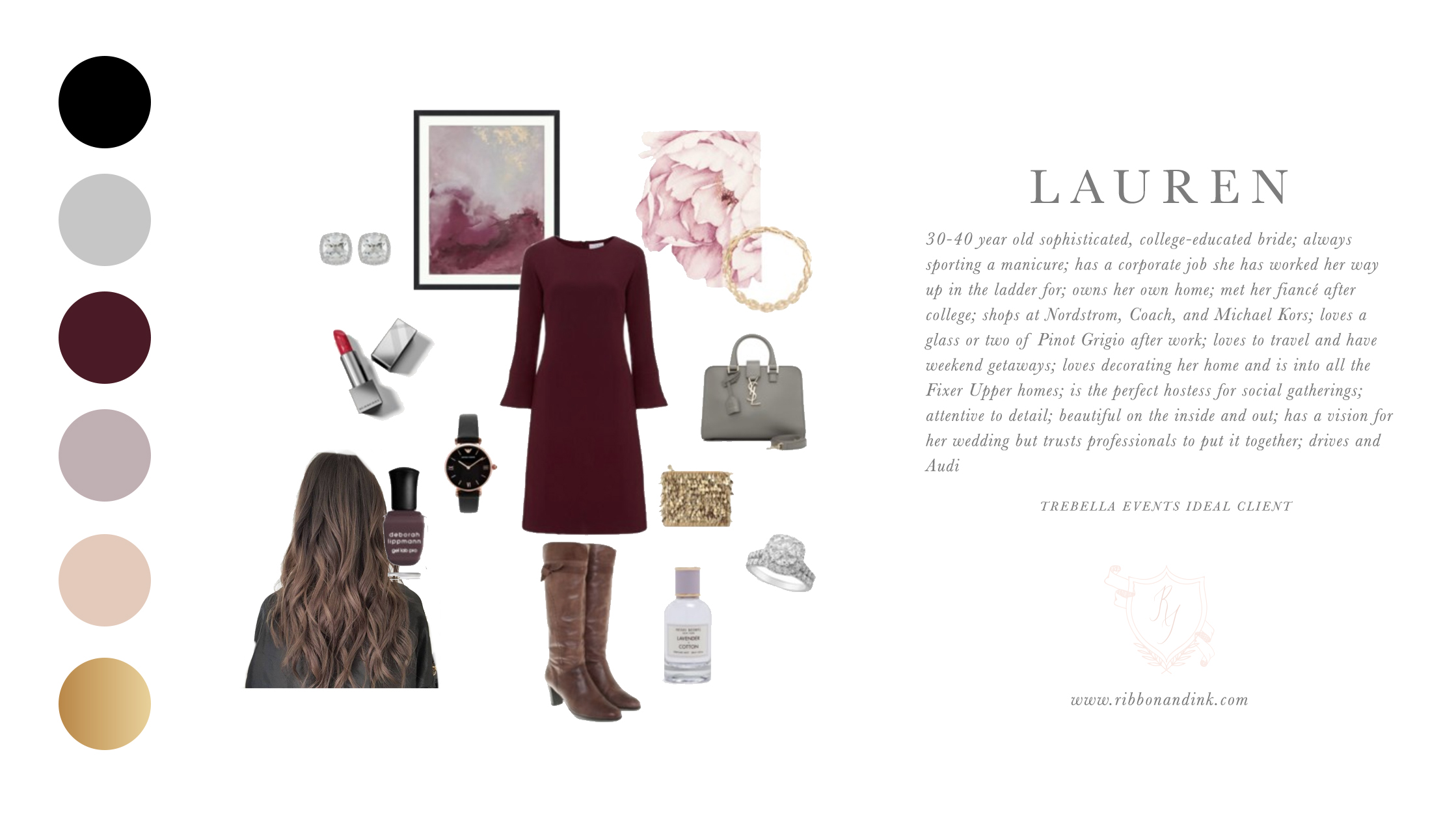
I created this ideal client mockup after reading through Shawn’s initial brand questionnaire:

We ended up using silver instead of gold but it’s just as fabulous.
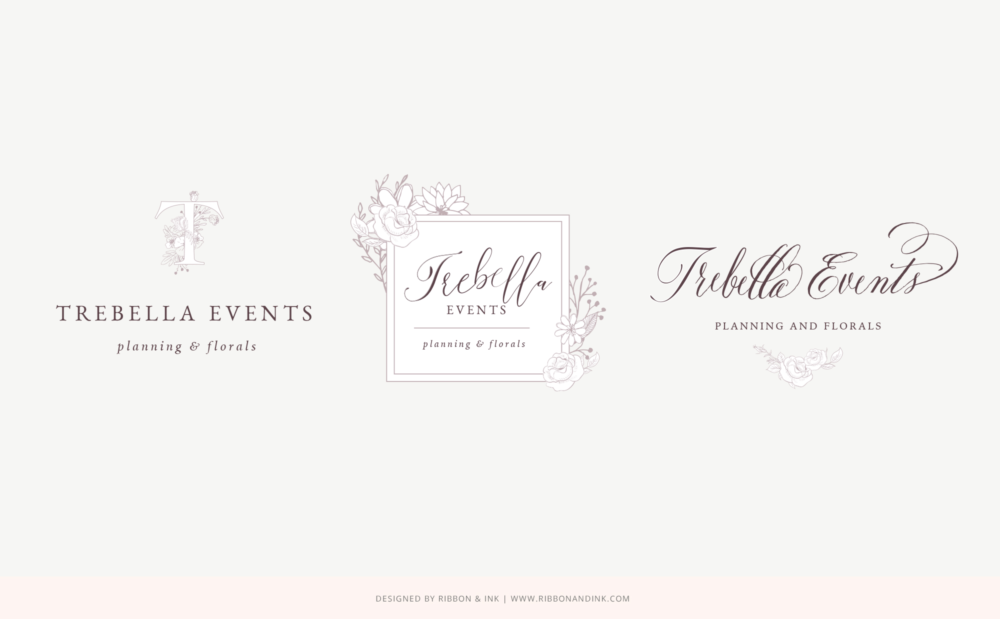
Shawn was pretty set on a script logo, but I happen to have a talent of changing clients’ minds. I knew from the get go I wanted her to have a strong serif font in her logo. I told her I’d give her some options and these were the initial ones:

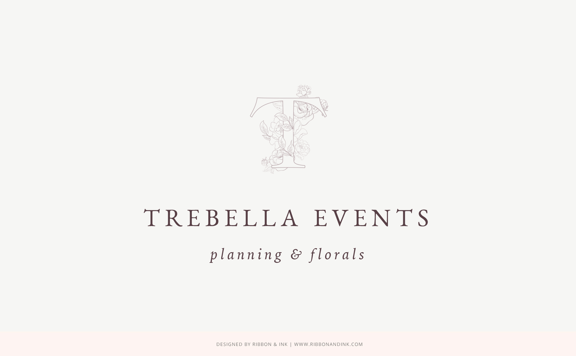
And low and behold she liked the serif one ;). She did want to tweak the flowers though so I used some different ones to make this her final logo:

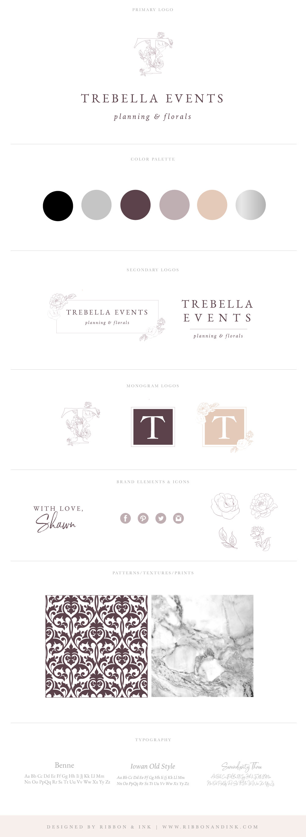
I’m pretty in LOVE with it! I’m in love with her brand board as well. This will be the blueprint for her brand:

I can’t wait to share her styled brand images and new site!
Care to learn more? Contact Katie!
Leave a Comment