I’ve had so much fun working with Long Island, New York floral designer AvaFlora, a husband and wife team, on their new brand. Lori had such a vision of what she wanted for her new brand. She actually initially contacted me about just revamping their current website, but after some emailing decided to redo the whole brand. Good call Lori! Our coaching session seemed to be eye-opening for Lori and Mike in the sense of recognizing the need to connect their visual brand to their ideal client. They wanted a more fine-art, refined, yet approachable brand.
I’ll be the first to admit that I don’t nail down a logo for all my full branding clients in the first round. Usually I give a version in the first round that is a good start and we fine tune in rounds two and three. THIS brand however took a bit more work…and that’s okay! Lori really wanted a custom illustration of leaves/flowers included in her logo. Part of being a graphic designer or any business owner is knowing what you can and can’t do. I know I cannot draw illustrated leaves. Fact. Therefore we outsourced the project of creating them to two different artists actually. It was the one puzzle piece that made this brand complete. After we had the final beautiful illustration from Poesie der Feder everything else fell into place easy.
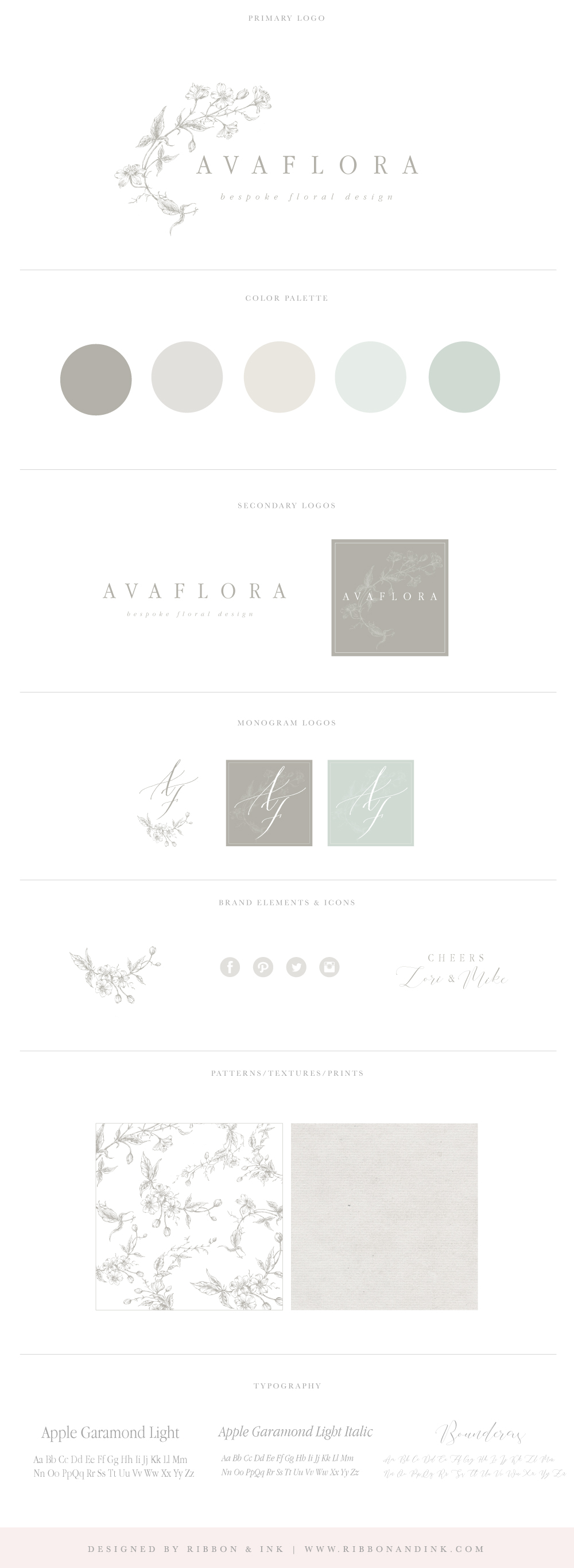
Here is the beautiful final logo and brand board:

I created a pattern from the illustrations Poiser der Feder provided. I think it turned out awesome!
I also included some hand calligraphy that she provided with the initial illustrations as part of their monogram logo.
Their neutral cream, tan, and green color palette is perfect for a bespoke floral designer.
The whole brand turned out so refined and I love it! I’m almost done setting up their site (with a shop!) and I can’t wait to share.
Leave a Comment